Logo
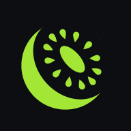
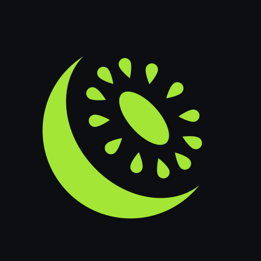
The logo is a kiwi cut in half that looks up and to the right. The skin is a lime crescent. The cut face is the dark ground showing through, with a core and twelve seeds.
- Spell it openNutrition. Lower-case o, capital N, one word. Also at the start of a sentence.
- Keep the two colours. "open" takes the text colour of the background. "Nutrition" is lime.
- Use the mark alone where there is no room for the word. App icons, favicons, avatars and notifications.
- Use the files. Do not redraw the kiwi, however tempting a fruit may be.
Construction
One drawing produces every file. It is made in a 1024 unit square from the numbers below and nothing else. A lime circle with an ellipse cut out of it leaves the skin as a crescent. Inside the cut sit an oval core and twelve seeds, each with its tip towards the middle. Then the whole fruit is turned 42 degrees.
| Element | Measure, in units | Of the diameter | Notes | |
|---|---|---|---|---|
| A | Skin | Circle, radius 345, diameter 690 | 100 % | Centred on the tile. |
| B | Cut | Ellipse 550 × 682 | 79.7 % × 98.8 % | Its centre sits 72 units (10.4 %) towards the face. It is taken out of the circle, so the ground shows through. |
| Crescent | 142 at its thickest | 20.6 % | 345 - (275 - 72). It runs out to nothing at two tips, 80.7° either side of the facing direction, so the skin covers 198.7° of the circle. | |
| C | Core | Ellipse 120 × 260 | 17.4 % × 37.7 % | At the centre of the cut. |
| D | Seed ring | Ellipse 316 × 444 | 45.8 % × 64.3 % | Same centre. A guide only, it is not drawn. |
| E | Seeds | 12 teardrops, 82.8 × 48.3 | 12.0 % × 7.0 % | Drawn 72 × 42, scaled 1.15. One every 30° around the ring, each centred on it with its tip towards the middle. |
| Room around the seeds | 50.6 to 56.6 to the core, 75.6 to 77.6 to the skin | 7.3 % to 11.2 % | Measured along the two axes of the cut. | |
| Turn | 42° anticlockwise | Around the centre of the circle, after everything else. | ||
| Mark on the tile | 690 of 1024 | 67.4 % of the tile | 167 units of margin on every side, 16.3 % of the tile. | |
| Lime on the tile | About 14 % of the area | Skin, core and seeds together. They cover about 39 % of the mark's own circle. | ||
| Maskable icon | Mark at 78 %: 538.2 of 1024 | 52.6 % of the tile | 690 × 0.78. Margin 242.9 units, 23.7 % of the tile, so a round crop never cuts the mark. | |
| Mark in the wordmark | 1.79 × the type size | The gap to the word is 0.64 × the type size. The mark's centre sits 0.33 × the type size above the baseline. |
For checking, not for rebuilding. The numbers come from the one file that draws the logo. If you need the logo, take it from the downloads.
Versions
Choose by the background. The lime versions are for dark backgrounds. On light backgrounds the mark uses a darker lime, because the bright one disappears on white.
App icon
Mark
Wordmark
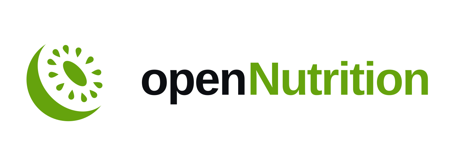
There is also a transparent wordmark for dark backgrounds.
Good to know. The wordmark SVGs contain live text in the system font, so the letters differ a little from computer to computer. When it has to look the same everywhere, use the PNG.
Clear space and size
Give the kiwi room to breathe. Leave a quarter of the mark's width free on every side. No text, no picture and no edge goes inside that space. The app icon files already include it.
| Element | Smallest on screen | Note |
|---|---|---|
| Mark alone | 24 px | Below that the seeds close up. |
| App icon | 32 px | The favicon size in the kit. |
| Wordmark | 140 px wide | Smaller than that, use the mark alone. |
Do and don't
- Do use the lime mark on the dark ground whenever you can. It is the logo at its best.
- Do use the darker lime or the black mark on light backgrounds.
- Do let the phone or the store round the corners of the icon. The master is square.
And these break it, at every size.
Colour
One lime, lots of dark. The colours are the same family as openGym: the lime and the ground are identical in both apps, so the two icons belong together at a glance. Tap a colour to copy it.
- Use lime as a signal. A button, a link, the word Nutrition. If everything is lime, nothing is.
- Put the ground on lime, never white. Text on a lime button is #0C0E12.
- On light backgrounds, shapes take #65A30D and words take #4D7C0F. The first is too light for small text.
- Active is green words, not a green block. A selected tab or link turns green. It does not get a filled bar.
| Colour | On | Contrast | Good for |
|---|---|---|---|
| Lime #A3E635 | Ground | 12.8 : 1 | Everything |
| Ground #0C0E12 | Lime | 12.8 : 1 | Text on lime buttons |
| Mono #F2F2F7 | Ground | 17.3 : 1 | Text on dark |
| Green text #4D7C0F | White | 5.0 : 1 | Words and links on light |
| Lime on light #65A30D | White | 3.1 : 1 | Shapes and large type only |
| Lime #A3E635 | White | 1.5 : 1 | Nothing. Do not. |
Also as CSS variables and JSON.
Type
The app and this site use the font your device already has: SF Pro on Apple devices, Roboto on Android, Segoe UI on Windows. It feels native and loads nothing.
- Big numbers, short words. Headlines are bold and tight. Body text is regular and relaxed.
- Steady numbers. Tabular figures for kcal, grams and tables, so they do not jump while they change.
- Sentence case. No all-caps headlines, no Title Case Like This.
- The wordmark is the system font at weight 800 with tight letter spacing.
| Style | On this site | Weight | Letter spacing |
|---|---|---|---|
| Display | 44 to 92 px | Bold | -0.045 em |
| Heading | 31 to 54 px | Bold | -0.035 em |
| Lead | 18 to 21 px | Regular | -0.01 em |
| Body | 16 to 17 px | Regular | -0.01 em |
| Small | 14 to 15 px | Regular, Semibold | -0.01 em |
Voice
Talk like a friend who happens to know nutrition: plain, human, a little funny. No hype.
- Plain words, short sentences. "You" and "your". If a sentence needs a second read, cut it in two.
- Say what it does. And what it does not. No "revolutionary", no "smart", no "journey".
- A little funny, never at the user's cost. Nobody is shamed for a pizza or a missed day.
- No advice it cannot back. No dosing tips, no medical claims.
- Mechanics. openNutrition, always. No em dashes. Digits with their unit: 200 g, 0.5 %, 2.2 g/kg.
Next to openGym
openNutrition and openGym are sister apps. When they appear together, they appear as equals.
- Same size, same tile, same corner rounding. Neither is the big one.
- Half an icon's width between them. Close enough to be a pair, far enough to be two apps.
- openGym first, openNutrition second when there is an order. It was here first.
- Never merge them. No kiwi on the barbell, no barbell in the kiwi.
- In text: "the sister app of openGym". Both names keep their own capital letter in the middle.
The openGym icon shown here is openGym's own file. Its rules are on opengym.ch/brand.
Using the brand
Use the logo when you write about openNutrition, link to it or build something that works with it. Please do not use it in a way that makes your product look like it is openNutrition, or like openNutrition made or endorses it.
Not sure? Ask: [email protected].
Downloads
Everything in one file: opennutrition-brand-kit.zip. Or pick what you need. The same rules to print or pass on: brand guidelines as PDF (29 pages, A4).